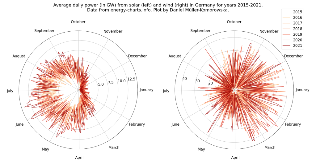
As the world tries to stop planet warming emissions, solar and wind power have taken central stage. One of the reason solar and wind go well together is their complementary seasonal pattern. The magnitude of this pattern depends on the location but in Europe winter means less solar power but more wind power. Summer on the other hand means more solar but slightly less wind. So if you want to have renewable energy all year round, it’s a good idea to build both solar and wind capacity.
On https://energy-charts.info/ raw data has recently become available for download and I have been doing data visualization to show the complementary seasonal pattern with actual data from several countries. Here I show some examples and the code. The code I am showing can be adapted for different countries. Here is the code and an example figure.
import os
import pandas as pd
import matplotlib.pyplot as plt
import matplotlib
import numpy as np

dirname = os.path.dirname(__file__)
data_path = os.path.join(dirname, 'data')

country = 'Deutschland'

raw_files = [os.path.join(data_path, f)
             for f in os.listdir(data_path) if country in f]

loaded_files = [pd.read_csv(f) for f in raw_files]

df = pd.concat(loaded_files, ignore_index=True)
df['Datum (UTC)'] = pd.to_datetime(df['Datum (UTC)'])
df['day_of_year'] = df['Datum (UTC)'].dt.dayofyear
df['year'] = df['Datum (UTC)'].dt.year
df['month'] = df['Datum (UTC)'].dt.month
df['day'] = df['Datum (UTC)'].dt.day
df['Wind'] = df['Wind Offshore'] + df['Wind Onshore']


# plt.figure()
# plt.hist(df.loc[df['year'] == 2021]['Wind+Solar'], bins=100)

# Calculate year as theta on the cycle
# df['theta_seconds'] = np.nan
# Plot solar development
df_daily = df.groupby(by=['year', 'month', 'day']).mean()
df_daily = df_daily.reset_index()

# Calculate daily theta
for year in df['year'].unique():
    boolean_year = df_daily['year'] == year
    days_zero = (df_daily[boolean_year]['day_of_year']
                 - df_daily[boolean_year]['day_of_year'].min())
    theta = days_zero / days_zero.max()

    df_daily.loc[boolean_year, 'theta_days'] = theta * 2 * np.pi

font = {'size'   : 16}
matplotlib.rc('font', **font)

solar_colors = ['#fef0d9','#fdd49e','#fdbb84','#fc8d59',
                '#ef6548','#d7301f','#990000']
fig, ax = plt.subplots(1, 2, subplot_kw={'projection': 'polar'})

for idx, y in enumerate(df_daily['year'].unique()):
    r = df_daily[df_daily['year'] == y]["Solar"] / 1000 # MW to GW
    theta = df_daily[df_daily['year'] == y]['theta_days']
    ax[0].plot(theta, r, alpha=0.8, color=solar_colors[idx])
    r = df_daily[df_daily['year'] == y]["Wind"] / 1000 # MW to GW
    ax[1].plot(theta, r, alpha=0.8, color=solar_colors[idx])

# Find month starting theta
month_thetas = []
for i in range(1,13):
    idx = (df_daily['month'] == i).idxmax()
    month_thetas.append(df_daily['theta_days'][idx])
month_labels = ['January', 'February', 'March', 'April', 'May',
                'June', 'July', 'August', 'September', 'October',
                'November', 'December']

for i in [0,1]:
    tl = np.array(month_thetas) / (2*np.pi) * 360
    ax[i].set_thetagrids(tl, month_labels)
    ax[i].xaxis.set_tick_params(pad=28)
    ax[i].set_theta_direction(-1)

ax[0].set_rticks([5, 7.5, 10, 12.5])
ax[1].set_rticks([20, 30, 40])
ax[0].set_rlabel_position(-10)  # Move radial labels
ax[1].set_rlabel_position(-170)
ax[1].legend(df_daily['year'].unique(), bbox_to_anchor=(1.1, 1.2))

fig.suptitle("Average daily power (in GW) from solar (left) and" +
             "wind (right) in Germany for years 2015-2021.\n" +
             "Data from energy-charts.info. Plot by Daniel" +
             " Müller-Komorowska.")
The code itself is pretty simple because the data already comes well structured. Every year is in an individual file so we need to find all of those in the data directory. Probably the biggest preprocessing step is to calculate the daily average. The original data has a temporal resolution of 15 minutes which is a bit too noisy for the type of plot we are making. Once we extracted year, month and day we can do it on one line:
df_daily = df.groupby(by=['year', 'month', 'day']).mean().reset_index()
Next, we calculate theta for each day so we can distribute the datapoints along the polar plot. Once we have that we are basically done. The rest is matplotlib styling. Some of these styling aspects are hardcoded because they are hard to automate for different countries. Here are two more examples:


Leave a comment